Lost in Translation: How Movie Posters Changed Over Time
If we look at the movie posters around us, we would probably feel those behind them follow the same formula every single time. The cinema industry gets more competitive every day, and taking creative risks or delegating the task to independent designers seems to be neglected in the process. In general, as long as a movie poster presents commercially relevant data, like genre, actors, awards or box office numbers, the goal is achieved. But this wasn’t always so.
Just a few decades ago, movie posters would rarely cross their local border, due to logistical obstacles, disparity of resources or military conflicts. This global scenario gave artists and designers the opportunity to propose very different images from the originals.
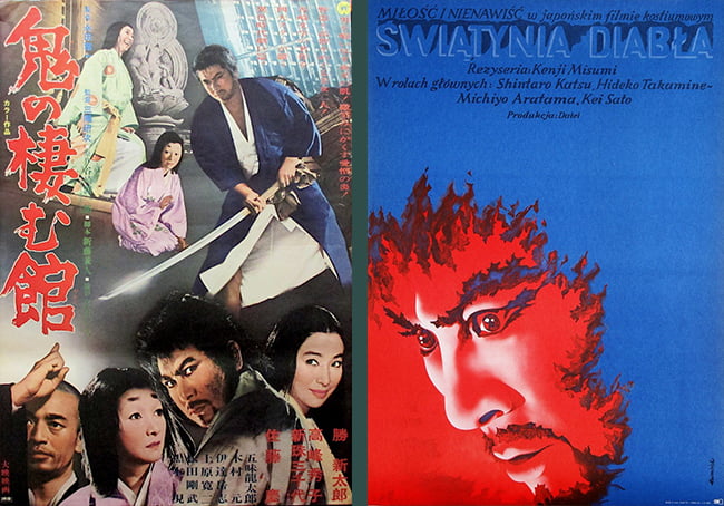
Devil’s Temple / 鬼の棲む館 (1969). Kenji Misumi.
Japan (left): Japanese photomontages overflow with contrasting scales and text.
Poland (right): By Tomasz Rumiński. Polish designers understood the potential of color and framing.
Posters and Cinema
Posters, as we know them, began in France in the mid-nineteenth century. By 1895, during the first public screenings of the Lumière brothers’ Cinématographe, they were already settled as the main channel of advertising in every corner of Paris. Cinema industry was, then, born and immediately found its everlasting ally.
Films started traveling the world, but countries reserved the right to create their own movie posters. Each of them handled the task in different ways, chasing different ambitions and under different circumstances.
During Hollywood’s Golden Age (from the 1920s to 1960s), the success of the star system as a recipe for blockbusters set a canon for movie posters that lasted for decades—this is: highlighting the movie star (and main attraction) with recognizable faces and big names. However, with the American counterculture, old Hollywood stepped aside. The New Hollywood movie posters showed rejection for these earlier standards.
Across the ocean, groundbreaking movie posters from the Russian avant-garde in the 1920s (like those from the Stenberg brothers) were created as an answer to the nation’s new political agenda. But these years of fruitful experimentation came soon to an end, when Socialist realism was declared “the official style of Soviet culture” 1.
In contrast with the mentioned situations, adaptations from Central and Eastern European and Cuban designers from the second half of the twentieth century approached true individual artistic freedom. None of them was being directed by profits or official aesthetics. Of this group, the unsetting and vibrant metaphors from the Polish School of Posters stand out.
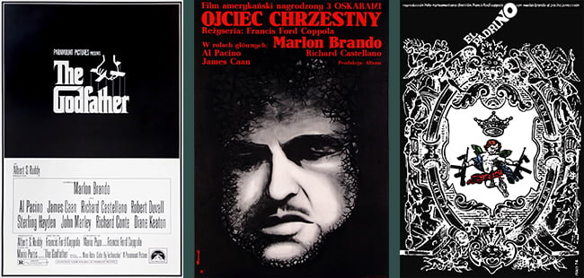
The Godfather (1972). Francis Ford Coppola.
USA (left): This is a New Hollywood poster. Having been made a decade before, this sober (yet solemn) design by S. Neil Fujita would have been very different.
Poland (middle): Tomasz Rumiński’s version replaced the earnest concept from the USA design for bitterness. Colors are used to emphasize certain feelings, like expressionists from the early twentieth century.
Cuba (right): “I strongly believe in humor. It is a palliative to enjoy what is expressed”2 says the author, Antonio Pérez Ñico.
Virtues and Limitations
Each country created posters according to the technology available at the time of production. Nevertheless, these limitations generally end up defining the artistic profile of a certain group. For example, the so celebrated visual rhetoric of poster designing from post-revolutionary Cuba—all commissioned by the ICAIC—would not have been the same without the screen printing.
The same nation-technique alliance emerged around the 1960s between Japan and their signature photomontages (inherited from Berlin Dadaists) with retouched photos that displayed their dominance overcrowded compositions. In addition, hand-painted movie posters from Bollywood are so bound to Indian identity that transition to the digital era is perceived by many as an offense to tradition and a threat to those dedicated to this craft.
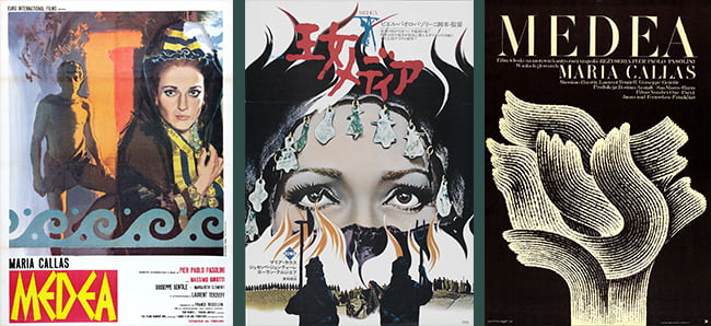
Medea (1969). Pier Paolo Pasolini.
Italy (left): Despite belonging to a subsequent generation, it shares attributes with the Italian neorealism posters.
Japan (middle): The superposition of scenes leads to the expressive eyes of Medea in the background.
Poland (right): By Andrzej Bertrandt. Maria Callas’ silhouette is made of flames. Although the concept is the same as the Japanese version (Medea and the fire), the result is completely different.
Reflecting a Movement
Cinematic movements shaped not only filmmaking but also poster designing. For instance, while movie posters for German expressionism are likely to have nightmarish chiaroscuro, distorted angles and sharp forms, the gloomy paintings for Italian neorealism will focus on the characters and their dramas. You can guess the link between the Soviet montage and their posters.
Some say movie posters reached their creative peak during the 1960s when the young, rebellious and experimental filmmakers of the French New Wave—or Nouvelle Vague—associated with likewise designers to reinforce a spirit that would spread all over the world.
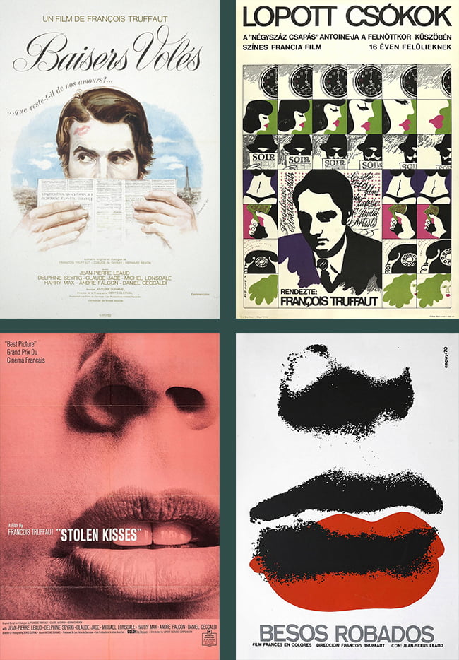
Stolen kisses / Baisers volés (1968). Francois Truffaut.
France (top left): From Nouvelle Vague artistic director René Ferracci. This picture is actually part of a poster series.
Hungary (top right): Drawn movie frames designed by András Máté, key artist from the colorful poster scene in the 1960s. The tagline references another Truffaut film, The 400 Blows, which is unusual for both the time and place.
USA (bottom left): Resembles the classic style of the New Hollywood era designs by Frankfurt and Gips. See their work for Rosemary’s baby (USA, 1968), Dracula has risen from the grave (England, 1968) Downhill racer (USA, 1969) or Emmanuelle (France, 1974).
Cuba (bottom right): By René Azcuy. Another example of remarkable Cuban poetry. The screen printing technique is at the service of an unpretentious joke (or is it the other way around?).
To see a more detailed study of this case, please, check out the amazing article on François Truffaut’s Stolen Kisses by Adrian Curry.
Conclusion
Nowadays, some of these adaptations endure hanging on walls—mine included—reduced to an ornament purpose, by their aesthetic value rather than the historical. Even so, what’s most attractive about them manifests only through a comparison exercise. Then, at least one fact is exposed: context is not invisible.
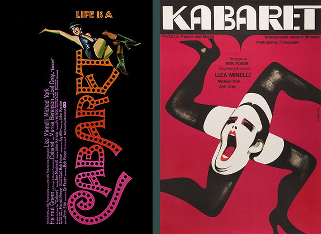
Cabaret (1972). Bob Fosse. EE.UU.
USA (left): By graphic designer Joe Caroff, who created some of the most iconic posters and logos from the 1960s onward. See West Side Story (1961), Last Tango in Paris (1972) or The Last Temptation of Christ (1988).
Poland (right): A whole different movie for Wiktor Gorka.
You Might Also Be Interested In:
Movie Poster of the Week by Adrian Curry.
The Poster Boys, blog and podcast.
Film movements: A beginner’s guide.
Cartelismos por Sebastián Vivarelli.
French New Wave film posters: ‘They broke the rules’ by Killian Fox.
The Polish School of Posters by Eugenia Luchetta.
50 watts archive.
