Distinctive Types
While many may not realize it, typography is an art form. Its use and application can impact how a viewer interprets the content presented to them. A simple example is the use of capital letters – today, content presented in all caps is interpreted as yelling.
You may be surprised to learn that there are rules and guidelines for typography and they vary based on the language. This blog will touch on some of the facets of typography and how it impacts content.
Text and Diacrisis
Part of knowing how to design text falls on the ability to give personality and clarity to those words laying in front of us. Written communication significantly improves when those responsible for its graphic representation can identify and accurately apply diacrisis—in other words, are able to visually emphasize fragments as needed to enhance readability.
Diacrisis — “to separate”—is a linguistic resource that implies highlighting or distinguishing some parts of copy from each other. When designing a magazine and formatting a title to differentiate it from the body content; when writing information about a book and we need to differentiate the title of a chapter; or when leaving a note on the refrigerator with a strategically underlined word that requires extra attention from the receptors, we are (in one way or another) applying diacrisis. It is also important to consider that emphasizing some parts over others allows us to manipulate the connotation of a message since we are orientating its meaning in a deliberate direction.
In typography, we have formal variables within the so-called typographic families (or font families) that precisely serve this purpose. The use of uppercase in full words (not really advisable) and quotation marks are considered diacritical signs. Each distinctive type has its own function, which a designer should pay attention to in order to obtain accurate interpretations within the formal parameters of communication.
Distinctive Types
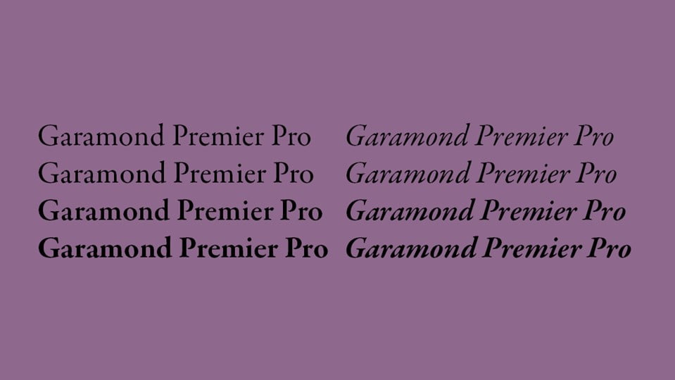
Italic
Compared to regular types, italics are defined by two characteristics: inclination and shape variation (a, a). It should not be confused with the script and roman oblique variables—the first one descends from calligraphy, while the second is slanted, but has no shape variation. Like it or not, we are forced by convention to apply italics when we write certain concepts. Among many, here are some examples:
Pseudonyms and nicknames, only if shown next to the real name — except for kings and queens. E.g.: Ernesto Che Guevara. / Philip I of Castile was Philip the Handsome.
Latinization of species. E.g.: Chamaemelum Nobile, known as chamomile.
Titles of works including paintings, plays, movies, TV shows, paintings, records, newspapers, magazines, etc. E.g.: Last night we watched Phantom Thread.
Names of ships and vehicles. E.g.: Christopher Columbus sailed in the Niña, the Pinta, and the Santa Maria.
Foreign words or expressions. E.g.: “There won’t be a next time, capisce?” said the woman.
Emphasized words (called stress in linguistics). E.g.: There’s the truth, and the truth.
Words followed by their definition. E.g.: An error in printing resulting from a mistake in typing is called a typo.
Apart from formal usage, designers might find it suitable to distinguish long segments of text or when they need to give the layout an elegant and expressive voice.
Bold
When it comes to standing out, using weight variables is a good option. Because of its volume, a bold word instantly grabs our attention. Depending on the context, it can be applied for both highlighting specific words and for differentiating text typologies in more “colorful” compositions. Typical usage is found in magazines, where questions from interviews are usually distinguished with bold, while the answers are kept in a normal style.. Although we are referring to the bold, the spectrum of weights in typographic families is usually much wider. Between regular and bold, might stand medium and semi-bold; in turn, after bold, might follow extra bold, black, heavy… The main thing is to achieve the right contrast. Moreover, if used extensively in body text the reading becomes tedious as a result of the extra strain on their eyes.
UPPERCASE
Both lower and uppercase are considered distinctive types, because using one or the other changes, not only the tone of text but also the connotation. You might have seen full capitalization being used to highlight or to imply some sort of solemnity and is reminiscent of the inscriptions at Trajan’s Column (think of how popular it remains in the legal field).
Nevertheless, almost every designer will advise not applying it in that way. The uppercase is linked to a strictly orthographic purpose and its rules (that will vary depending on the language) and shape precedes this end. Therefore, its abuse is most likely to be visually unpleasant. As long as there are other distinctive types available (which there are), full capitalization should be avoided.
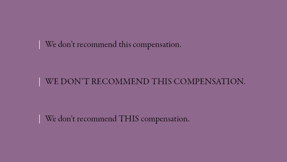
Small Caps
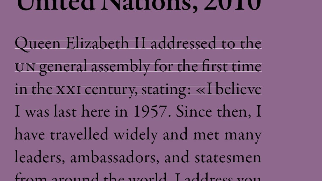
No, small caps are not smaller uppercases. Small caps emulate the shape of the uppercase but have the height of the lowercase and a different purpose. Not every font family includes small caps—in fact, these are quite exceptional to find. Computer programs such as Adobe InDesign usually offer within their interfaces, an option to apply small caps, however, what this does is create fake ones through a basic shrinking of the uppercase version. If we compare a real small cap against a fake one automatically generated by software, we will see how different their strokes are. This is essential because small caps are made to converge. Besides working as a very elegant yet modest distinctive type, small caps are to be considered for initialism, Roman numerals (as long as they don’t accompany capitalized words, like proper nouns), etc.
Quotation Marks
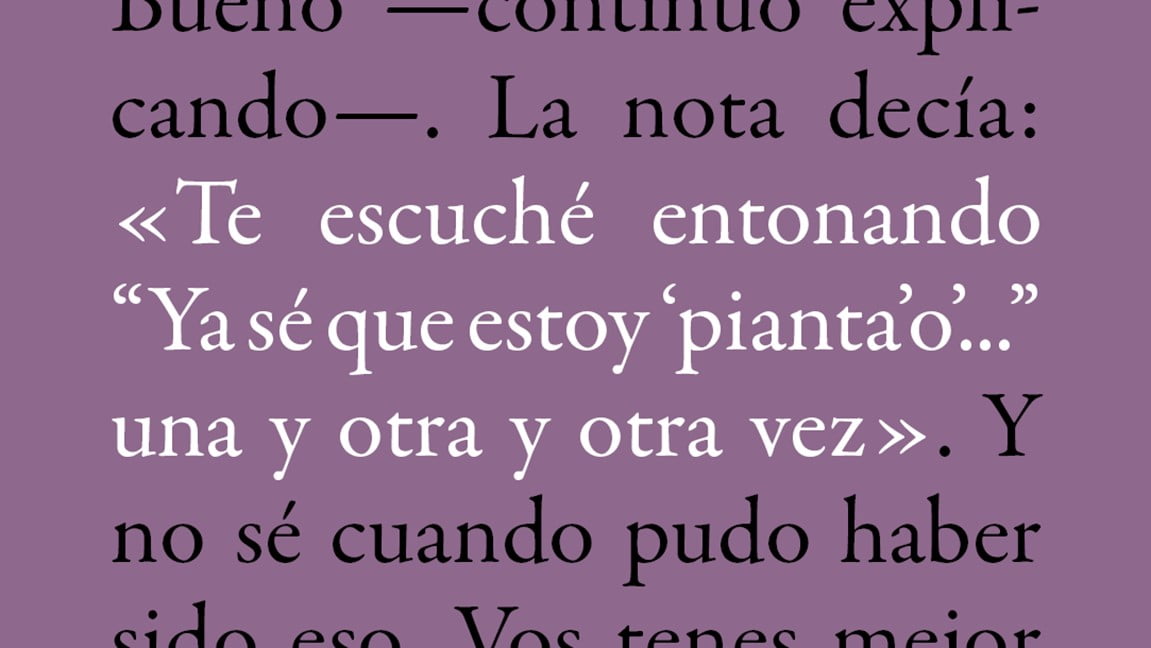
Quotation marks are punctuation marks that indicate citation, irony, colloquialism, etc. Specifically, they serve to differentiate copy that is typed just as they were written or pronounced. There are many types of quotation marks: double quotes (“ ”), single quotes (‘ ’), guillemets (« »), single angle quotes (‹ ›)[1], typewriter or neutral (” ” / ‘ ’)[2], CJK quotation marks (「 」, ﹁﹂ / 《 》), etc. Needless to say, which ones to use, when, and how to combine them will depend on the conventions and norms of each language (and country). This is something to carefully be aware of while working with different languages. Examples of the hierarchy of quotation marks in some languages (and countries) can be seen below:
English (United States): “…‘…’…”
English (Australia): ‘…“…”…’
French (France): « … “ … ” … »
German: „ ‚ … ‘ “ / » › … ‹ «
Hungarian: „…»…’…’…«…”
Spanish: «…“…‘…’…”…» / “…‘…’…”
Color
In a monochromic context, a subtle way to highlight or differentiate specific fragments of text may be through color. Even so, because of technique or budget constraints, it is not common to see color used this way, for example, in books or newspapers. However, in digital media, there is more freedom to use it because it is more easily applied.
Conclusion – Dos, and Don’ts
Dos
Choose fonts foreseeing the diacritical needs of each scenario. Distinctive typographies—such as the small caps—are not available in every existing font. Moreover, we might find out some fonts do not have a proper range of quotation marks. So, when we know our work will demand specific elements or variations we must, first of all, find a font family that best suits our project needs.
Check usage correctness. Each variable has its own function. Italics are not the same as quotation marks, and the uppercase is indeed not a replacement for the small caps. When in doubt, researching these rules will improve communication.
Check context. Some scenarios are more formal than others. Strict citation styles for academic writing like APA, Chicago, or MLA have rigorous instructions to guarantee homogeneity. On the other hand, other contexts may allow designers to break the existing rules and explore creativity.
Don’ts
Avoid redundancy. One distinctive type may be enough. Applying several in the same composition when not necessary, will cause the opposite of what it is meant to. Less is more.
Don’t think about it as an ornament. Distinctive types aren’t to be understood aesthetically, but functionally.