Responsive Web Design for the Global Market
What is Responsive Web Design (RWD)?
Responsive web design (often abbreviated to RWD) is an approach to web design in which a site is crafted to provide an optimal viewing experience-easy reading and navigation with a minimum of resizing, panning, and scrolling-across a wide range of devices (from desktop computer monitors to mobile phones). source: Wikipedia

Even before Ethan Marcotte was credited for coining the term Responsive Web Design in a May 2010 article, web designers and marketers around the world were already wrestling with the idea of how to create web pages to display content that could be consumed on devices not yet conceived. The challenge has been to create attractive sites that have a flexible architecture while still containing the rich content and easy navigation, regardless of real estate. In basic terms, it is a website design that automatically adjusts the layout based on any screen size.
Why should I care?
2013 has already been predicted as the first year in the post-PC era. It is likely to be the first full year where we will witness a net decline in worldwide sales of PC/laptops. The wide proliferation of mobile device use have webmasters reeling as they are pressed to create best-of-breed visitor experiences across all screen sizes. The following graph illustrates the widespread use of non-PC devices by country.
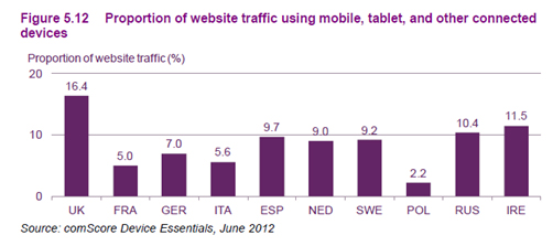
Given that the US trails all of the countries listed above, companies operating outside the US will benefit even more from adoption of RWD.
How does my site become more ‘responsive’?
RWD is an adaptive layout design that uses CSS3 media queries to dynamically adjust content to fit the destination screen size. This is performed by using fluid proportion based grids and flexible images (marcotte).
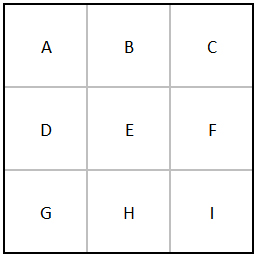
Kristina Kledzik at Distilled, an interactive agency, describes the process in simple terms in a recent article on SEOmoz. “Let’s start with a simple example on a grid, using 9 rectangular elements labeled A-I. On a small screen, like a tablet or an older computer with fewer pixels, the elements would display themselves in a 3 x 3 grid:”
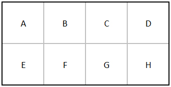
When the screen is wider, those elements can spread out:
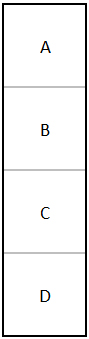
When it’s narrower, they can stack:
What complexity does a multilingual website add to design considerations?
Added complexity and design implications are introduced to RWD with multilingual content. Depending on the language, different space considerations must be added to any design element that includes text. If the source language is English, but the content is to also be translated to Chinese you will likely see additional white space appear when displaying the content in most form factors. Conversely, if the destination language is Arabic, the designer will need to make allowances for about 20% space consumption for the translated content. Additional consideration must be paid if right-to-left language orientation such as Farsi, Arabic, Hebrew and others might also be displayed.

Does responsive web design help SEO rankings?
Many websites have made an effort to build mobile websites only to find that it hurt their organic rankings. However, Google announced last year that it was now updating its algorithm to favor websites that take advantage of RWD practices. Many advertisers are still waiting for the needed flexibility to be built into Google AdSense, but it is clear from Google announcements that companies can realize some first-mover advantages by adopting RWD.
Alert GoogleBots through prescribed annotations. Google maintains a developer site to answer specific questions on many topics, including mobile-optimized websites. Specifically related to RWD websites, it recommends that if you use the different HTML approach but the same URL, Google wants you to use the HTTP Vary Header as a hint for GoogleBot-Smartphone to crawl the site.
For those marketers who actively participate in linkbuilding to enhance rankings, Google will recognize your various design considerations as a version of your main site. Thus, your rankings will benefit as a result of implementing RWD. Conversely, if sites are built for individual devices, your link paths will be weaker as mobile-dedicated (m-dot) site links will appear unrelated to your main site links to Googlebots. Simply put, Google will combine all of the likes from interactions on various devices to count toward your main site rather than recognize each as independent websites. And most importantly, an adaptive design is more appealing and easier to use on various devices. If visitors ‘stick’ to your site after clicking through from the search page, Google can assume that they were successful in directing you to the appropriate website.