Arabic Fonts: The ongoing challenge
You hear it all the time in the discussions about web or digital design with the Arabic language. I don’t like the Arabic fonts or Arabic typography used in general. No one is satisfied with the font their designer used on the web site! Why are you using that classical, less stylish font for Arabic though the font used for the English is so fancy?! Why are you using only regular and bold faces for Arabic – why don’t you use light, thin, black, italic or narrow typefaces for Arabic? Why does the Arabic text appear much smaller in size than the Latin-based text though it has the same format attributes? These are some of the many issues always discussed in design circles when it comes to Arabic graphic design.
Finding an Arabic font with the 4 faces (Regular, Italic, Bold and Bold Italic) is like finding a needle in a haystack. If you find it, you are hampered with the technical challenges you face if you decide to use it. So what’s the problem? Why are there only a few trusted and faithful fonts for Arabic? Why is it so difficult to find a variety of Arabic fonts with different faces to suit different contextual and design uses like you can find for the range of Latin-based languages?
Well, there are three main issues with the Arabic language and Arabic typography that make it a really challenging language to put on paper or screen with a richness in design. Curious as it is, considered one of the richest languages in the world in terms of expressiveness and number of words.
Arabic Script is Complex
For us – Arabic native speakers – we discover Arabic is really a complex language only when we start to study other Latin languages like English or German. The calligraphy of the Arabic writing system is one of the most complex writing systems in the world of languages. The following are a few of the reasons why:
- Right to Left Language: Arabic is a bidirectional language and is written right to left. Thisfact held up true web support for a long time. Recent advances in Internet browsers and software support have helped here, still though with many shortcomings.
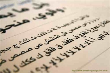
- Joining Script: Arabic uses a joining script, each of the 28 Arabic letters has 4 glyphs for representing the letter according to its position in the word: initial, medial, final or isolated.
- Dots and Diacritics: Each character is not characterized only by its shape, but also by the number of dots above or below it. The same character shape but with a different number of dots or different positions means it is a totally different character. Arabic has a consonantal alphabet and the vowels are represented with the diacritics (Tashkeel or Harakat). The diacritics cannot be ignored, or it is left to the reader’s knowledge to guess the vocalization of words.
Lack of studies and programs on Arabic Design
There are only a few books on Arabic type design and Arabic script analysis. There are no specialized institutes or even departments or course programs within the major Arabic universities that have programs dedicated to Arabic Design.
The technical challenges with creating fonts for Arabic
- Consistency and harmony in letter sizes and forms: Letters, numbers, punctuation, and all other characters like %, &, etc., must be of the same shape. Latin and Arabic letters must be in harmony with each other. Letters of different forms must be also of the same shape with only different thickness or angle of Italic. Inconsistency between letters and numbers of the same font are shown in this example:
![]()
Disharmony between Arabic and Latin letters of the same font is shown in this example:
![]()
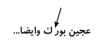
- Letter position and spaces around: The space before and after each glyph in the four positions (initial, medial, final or isolated) in a word also must be considered. Here is an example of an extra space in a glyph which causes the word to be cut off into two parts when that letter comes in the medial position:
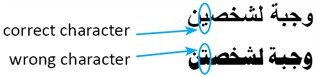
- Complete and correct character sets: No glyphs should be missing and the text should not change when the font is changed. Here is an example of what happens when I change a font for some word; one letter is changed to a different letter giving another different word:
- Various forms of the font: Variety of the font forms is one of the important factors that affect the decision of the designer or the font user. The less forms of the font the less use of it.
- Arabic diacritics and Hindi digits are a must: The glyphs for the Hindi digits must be contained in the font otherwise the Latin numbers will be used instead, which is not always acceptable in the Arabic context. The Arabic diacritics must be used in some contexts and if the font has no glyphs for them, they will appear as corrupted characters or will be shown in a substitute font. Here is an example of a font that misses the Hindi digits glyphs and also the parentheses:
![]()
- Harmony with dots and diacritics: The relation of the dots and diacritics to the characters and to one another must be considered. Here is an example of a nice looking font that has no consideration for the diacritics position nor their relation to the dots and the letters:
![]()
Does Adobe finally have the answer?
Adobe has recently provided its Adobe Arabic and Myriad Arabic fonts. Does this take us closer to overcoming the many challenges with Arabic fonts or do we still have shortcomings? This is the subject of my upcoming blog so stay tuned!