Comic Sans: The Typeface We Love To Hate
“Comic dogs don’t talk in Times New Roman”, thought Vincent Connare. In 1995, Microsoft published a new program called Bob. The intention of Bob was to facilitate the experience using Windows on PC and make it more intuitive.
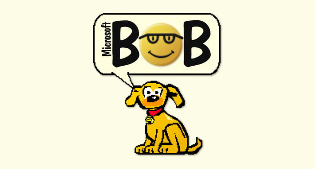
Image by: Microsoft
The Beginning
Type designer Vincent Connare designed Comic Sans to be used in the dialog balloons of a little animated dog who will help first time users to navigate the Windows interface. He created a typeface which looks fun and friendly, inspired by the typefaces used in comic books and designed to have a handwritten look and feel and targeted at younger people. “My original idea was it was going to be used for kids. It wasn’t made for everybody to like it”, said Connare. In addition, it was designed manually due to European copyright laws and that is why it does not look or feel like any other typeface used in comics. On that note, David Gibbons (creator of Watchmen) said: “I think the Comic Sans font is dreadful”.
Fun fact: Comic Sans did not meet the deadline to appear in Microsoft Bob 1.0, and Bob 2.0 was never published. Nevertheless, Comic Sans persisted.
Expansion
Unexpectedly, the prevalence of Comic Sans rose and the font started to appear in formal documentation, billboards, posters and advertising. In 2002, Dave and Holly Comb, both graphic designers, started the movement “Ban Comic Sans”. This initiative drew attention from designers all around the world, which started to raise the voice criticizing and mocking the controversial font. The situation magnified in such a way that when Connare asked to give a conference in the London Museum of Design, he received complaints arguing that he should not be there. “I think I had a bodyguard!”, he joked.
In the early 2000’s, Barbara Chaparro led an investigation at Wichita State University, Kansas, with results showing that humans perceive the characteristics of type families in three main aspects: “robustness and masculinity”, “beauty” and “emotion,” said Chaparro.
Later studies showed when having to decide on the suitability of a typeface for a formal document, alternatives classified as “readable” or “beautiful” are preferred over the “emotional” or “noisy” ones. According to Chaparro, this implies that humans have the ability to specify when a font is appropriate for a given context.
“Historically, serif fonts were used for business documentation. Maybe that’s why we linked them to formal writing,” suggests those who led the research. The terminations at the ends of the antlers reflect elegance to the average eye. Therefore, professional documents tend to use formal fonts. Sans fonts, by not having these serifs, look more casual than serifs.
“What is clear to typographers is that Comic Sans is a sans typeface, designed for informal, casual use and for material similar to a comic book. I don’t think it was created for serious documentation”, said Barbara Chaparro.
Why Do We Hate It?
Comic Sans is a very particular case. Choosing it is problematic because of the hatred it brings. According to Connare, when computers became the norm in homes, users began to have a possibility that they lacked before, that is anyone could choose from a variety of sources to personalize their documents. “This was the first time that people had a choice, so they were picking crazy things because they could do anything,” he says. And adds: “People did not have much experience, and so they just picked what was different.” Due to its appearance, Comic Sans began to gain adoption quickly.
Connare said when meeting people and talking about Comic Sans, surprisingly, he received confessions regarding the fanaticism for his creation. “Most people are friendly and nice about it. It’s like it’s a song that they don’t want anybody to know that they like.” On the WIRED2015, he said: “Twenty years ago, I made the best font in the world”.
So Is It Better Than We Think?
Comic Sans is a typeface that favors the reading of those who suffer from dyslexia. In principle, because it is one of the first digital fonts to be anti-aliased. Anti-aliasing is a “smoothing” process to facilitate screen legibility.
The vast majority of typeface families repeat some morphological patterns to create different letters. For example: “p”, “q”, “b” and “d”, at first glance, it looks like the same sign reflected or rotated. However, this does not happen in Comic Sans. Its irregular shape helps to differentiate the letters much more quickly and effectively. To that point, it is one of the few fonts recommended by organizations such as the British Dyslexia Association and the Dyslexia Association of Ireland.
This irregularity forces us to make an effort to read and retain the information, avoiding distractions and this makes it ideal for dyslexics and people with attention deficit.
Comic CERN
One of the most striking aspects of the announcement of the Higgs’ Boson was the use of Comic Sans for the slides of its presentation.
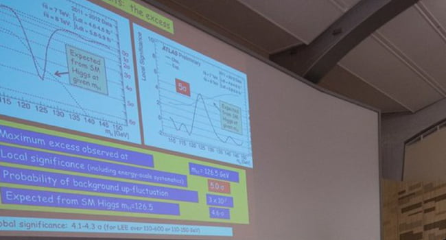
Image by: CERN
In this regard, the person in charge clarified that the choice is due to the fact that “it is a sweet and pleasant typeface”. In addition, he was surprised by the repercussions that this fact had, to the point that there was a campaign in the United Kingdom to rename Comic Sans to Comic CERN (European Organization for Nuclear Research).
Conclusion
Here seems to be the dilemma for those who make fun of the Comic Sans’ characters. The font started to be used for contexts for which it is not prepared. This makes some designers angry since it conveys a mismatch between what is meant and how it is said: a fun and childish typeface for a potentially serious subject.