Chinese Desktop Publishing Best Practices
Chinese has become one of the most translated languages among all other Asian languages. It follows that the need for Chinese DTP (typesetting or formatting) after a document is translated is a service need that is growing as well. With Chinese being such an important and prevalent language of international commerce, creating documentation adhering to the highest standards for Chinese Desktop Publishing (DTP) becomes more and more important. In this blog I will touch on some guidelines and best practices for Chinese Desktop Publishing.
- Font selection: Generally speaking there are 2 groups of fonts – system fonts and non-system fonts. When designing or localizing using common office applications for example, say a presentation in MS PowerPoint, it is suggested to use the system fonts. This would ensure the presentation be displayed correctly on any computer without corrupting the Chinese characters. However when working on a brochure, manual or poster, uses that really require professional DTP applications such as Adobe InDesign, QuarkXPress etc., the choice of system fonts would be very limited. For more detailed description about Chinese font selection, please refer to: How to Use Fonts for CCJK.
- Type size: It is common practice for a typesetter to use the same type size as the original English text in the localized Chinese version. The Chinese characters however tend to be bigger than the English even in the same type size. There is not a tremendous difference in the body copy, but for larger headings or titles, the difference can be considerable. You may want to go ahead and use a smaller type size in this case for the Chinese version.
- Kerning: When translating from English into Chinese the text will contract instead of expand unlike some European languages. Thus in order to achieve the similar layout as the original English document, adding the kerning slightly would be a good choice.
- Justify alignment: Unlike English as well as some European languages Chinese DTP requires justified alignment for body paragraphs. The work sample below (on left hand) shows the justified alignment, which is suggested. On the right hand side is the sample for not applying justified alignment, which isn’t as appealing to average Chinese audiences.
- Widows or orphans: Widow lines or orphan characters are not generally accepted by Chinese audiences, thus should be avoided throughout a document. (In typesetting, widows and orphans are words or text strings at the beginning or end of a paragraph, which are left dangling at the top or bottom of a column, separated from the rest of the paragraph. Source: https://en.wikipedia.org/wiki/Widows_and_orphans)
When this happens, you can adjust the kerning or add a soft return to move down a character from the previous line. Please see the last line of the work sample below.
 |
Change to>> |
 |
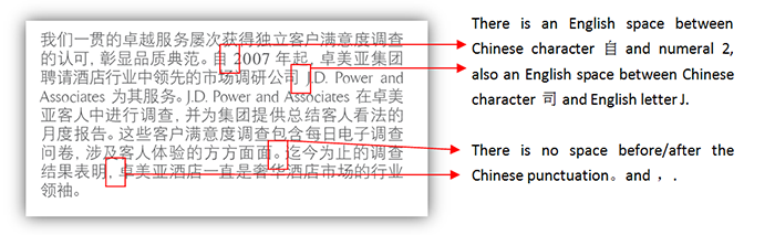
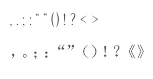
- Punctuation: In general nearly all punctuation appearing in a Chinese document should be Chinese punctuation. Chinese punctuation tends to be bigger than English, and one Chinese punctuation mark typically occupies one Chinese character’s space. In addition, no space should appear before or after it. The sample below shows the differences between the English punctuation and Chinese. The 1st line is English punctuation and each is followed by a space. While the 2nd line is the corresponding Chinese punctuation and there is no space between.
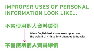
- Font changing: In order to draw an audiences’ attention the original English text may be changed from lowercase to uppercase, however, Chinese does not have the corresponding uppercase or lowercase form. Therefore a heavier weight of font may be applied to achieve a similar result.
- Sort order: Technical manuals always have an Index at the end of the document with alphabetic sort order the norm for an English Index. For Chinese this is handled differently as well. Simplified Chinese uses Pinyin* as its order while Traditional Chinese uses the number of strokes.
*Pinyin, formally Hanyu Pinyin, is the official phonetic system for transcribing the Mandarin pronunciations of Chinese characters into the Latin alphabet in China, Taiwan, and Singapore. It is often used to teach Standard Chinese and spell Chinese names in foreign publications and may be used as an input method to enter Chinese characters into computers. (See https://en.wikipedia.org/wiki/Pinyin)
- Space: A space is used only in between English letters and Chinese characters or between numerals and Chinese characters. Also no space should appear in between 2 Chinese characters or before/after a Chinese punctuation. In addition, only English space (with English font applied) should be used, but not Chinese space. This is because one English space occupies one English letter’s space, but one Chinese space occupies one Chinese character’s space which is approx two English letters’ spaces. In short, the Chinese space is too big in terms of width. The sample below shows the usage of spaces in a Chinese layout.