How to Use Fonts for CCJK Characters and Punctuations
When you have an English flyer, brochure, or manual and want it to be translated and desktop published (DTP) into CCJK (Simplified Chinese, Traditional Chinese, Japanese and Korean), this article will be a good start to help you understand some standards and best practices when dealing with Asian language fonts. While localizing Western languages, choosing fonts doesn’t seem to be a chore but an easier creative decision. For CCJK languages though, there are a few guidelines we need to keep in mind when selecting fonts properly including impacts on CCJK punctuations. For punctuations, there is much more we can talk about, but in this blog we will just discuss the considerations of selecting fonts for punctuations.
CCJK fonts and translation
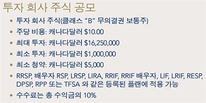
While translating into CCJK, not everything will be translated into the CCJK characters. Some numerals or Latin letters will be left as they are in the source text. From the examples below we can see for the non-translatable texts, we keep them in the same fonts as the English source – this means we never apply CCJK fonts directly to the numerals or letters. Applying directly CCJK fonts to everything seems to be much easier, quicker and a more straightforward way in terms of formatting however, we never do so in order to make the target artwork files look as close as possible to the source.
 |
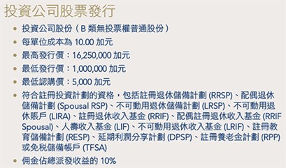 |
– Work sample for applying Korean (Chinese) font(s) to Korean (Chinese) characters and applying English font to Latin letters or numerals.
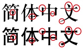
In order to demonstrate what I am talking about, let’s just take 1 line from above samples and enlarge it then we can have a closer look at the differences between using a Korean font and an English font to Latin letters.
![]()
![]()
In the 1st line, we used the English font for Latin letters, while in the 2nd line, we applied Korean font to all Latin letters. If you look carefully you would see the different shape and style for each letter. Somebody may think the differences are not huge so why is it necessary to do so. However, with any truly professional DTP team, we need to focus on every detail AND we should respect the choice of your source font style first and then we convey and reflect this kind of style into all your localized target materials.
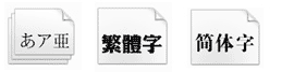
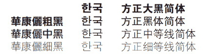
Now we need to choose the CCJK fonts for CCJK characters that closely match with the source font faces and weights. When we talk about font faces we generally divide them into 2 big categories – Serif fonts and San-Serif fonts. When the source text uses a serif font, we use CCJK serif font to match and vice versa.
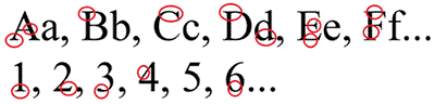
– Sample of Serif font (please look carefully for the places circled in red and compare with the sample below).
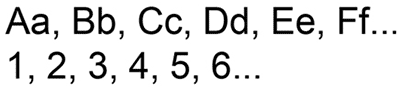
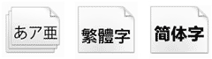
– Sample of San-Serif font (please look carefully and compare with the Serif font sample above).
CCJK fonts also have Serif fonts and San-Serif fonts. Please see below samples to see the differences between them. The 2 lines below have identical Simplified Chinese texts, but we just applied different fonts. The 1st line uses Serif font while the 2nd line uses San-Serif font.
– Sample of Serif font for Japanese, Traditional Chinese and Simplified Chinese.
– Sample of San-Serif font for Japanese, Traditional Chinese and Simplified Chinese.
Font weight
Font weight is another thing we need to take into consideration while working on customers’ documents. Below the English texts have the weights ascending from light to heavy, while the CCJK characters have the weights descending from heavy to light.
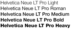
– Different font weights for English texts.
– Different font weights for CCJK characters.
Language punctuations
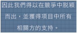
For these 4 languages, the font usage for punctuations is different when the target language is different. For Korean, it uses English punctuations, so all punctuations should be applied to English fonts just like the numerals and Latin letters. For the other 3 languages (Simplified and Traditional Chinese and Japanese), all punctuations should use the same fonts as CCJ characters. However, there is 1 exception and it is the bracket.
When the content found in brackets are completely Chinese text, for example, the Chinese brackets (with Chinese font applied) should be used. When the content in the brackets are English text or numerals, the English brackets (with English font applied) should be used. Please refer to the work samples as shown as below.
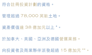
– Chinese Work sample: for the look of some of the Chinese punctuations (1 Chinese punctuation takes the place of 1 Chinese character).
– Chinese Work sample: for the look of some of the Chinese punctuations (1 Chinese punctuation takes the place of 1 Chinese character).
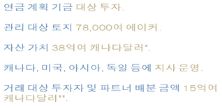
– Korean Work sample: English punctuations are applied.

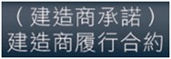
– Chinese Work sample: for the usage of different brackets (1 English bracket normally occupies half-letter’s space, but 1 Chinese bracket occupies 1 Chinese character’s space).
The selection and usage of proper fonts in the translation and desktop publishing business are critical, especially for languages such as Chinese, Japanese and Korean. Hopefully the above gave you some insight into how font selection and usage for Asian characters and punctuation is handled.
You may also find our previous blog on multilingual fonts useful: How to Choose the Right Fonts for Multilingual Documents.